RELATIONSHIP BETWEEN EXTERIOR AND INTERIOR PLACES
Sunday, May 8, 2011
Thursday, March 24, 2011
PROJECT 1: VILLA MAIREA
PLANS, SECTION AND AXONOMETRIC
FLOOR PLAN
FIRST FLOOR PLAN
AXONOMETRIC
The software that I used is Revit Architecture. Revit Architecture is a fantastic software for 3D modelling. However, the 2D drawings that they produce looks a little bit technical. In my opinion, Its a great tool for commercial activity but to achieve a conceptual drawings, Autocad is a better software to use. Furthermore, I'm still very new to this software, thus my ability to explore it is limited.
THE ANALYSIS
THE RELATIONSHIP BETWEEN THE MAJOR PART OF THE HOUSE
Aalto's ideas of the relationship between the spaces in the building is that the mot important part of the building must be at the center. In my opinion there are two important parts in this building which are the courtyard and the living room. He thought that every other spaces should connect to these important spaces.
THE CIRCULATION
The second analysis is the circulation. In my opinion, the circulation inside the building is very dynamic. In villa Mairea, there are a lot of steps and the floors is not all leveled. For example, it has a dented entrance and it has a higher level mezzanine inside the studio.
THE SITE ANALYSIS
The house is surrounded by forest. Aalto's idea is that the house seems like it filling the empty spaces of the landscape. As you can see, he made a lot of the interior to imitate the nature of the landscape. Aalto try to cover as much land as possible so that every part of the house have different views of the landscape.
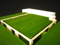
THE 1:100 MODEL
Friday, October 22, 2010
WORKSHOP 3 - DRAWING AND RENDERING
The significant aspect of the Avalon House is the landscape. I choosed black and white scheme because a dramatic drawing of the landscape could be achieved from tonal variation of pencil. Its hard to achieve it using colour pencils. Furthermore, trees also is one of the important element in the landscape. I choosed a very soft green colour by using soft pastel. The reason behind this is because to prevent the colour of tree to outshine the landscape. Apart from that, another aspect of my drawings is the composition. What I want to portray here is continuity and unity of a presentation drawing. The part that i found in the making of the drawing is how to control the tonal variation. Plus, I do not know hot to draw shadow in architectural drawing.
Monday, October 11, 2010
THE SITE MODEL OF FISHER HOUSE
What I found difficult in making the model was to cut the contour. In this exercise, we were given a choice to choose a selection of material to differentiate different element of the side. The materials that I choose were Balsa for timber,boxboard for the contour, wire for the trees, and corrugated box for the rock. while for the creek, I peeled off on of the layer of the boxboard to get a textured skin.
THE FINAL FISHER HOUSE
Fisher House by Louis Kahn has a very interesting approach of design principle. He used classical grid method in most of his design. In term of making this model, I find it difficult to make a craft detail model at a large scale. Much caution have to take in making the model. Balsa has been the main material for my model and I manipulated the use of it to describe different part of the house.
Monday, October 4, 2010
CHURCH OF LIGHT
The significance of Church of Light by Tandao Ando is how he conveys light into the building. Its a very unique church. To make the model of the building is not that difficult. However, I find that to capture photographs and deliver the meaning of the building is a bit tricky. I play with natural light and shadow in photographing the model.
Monday, August 16, 2010
Subscribe to:
Posts (Atom)